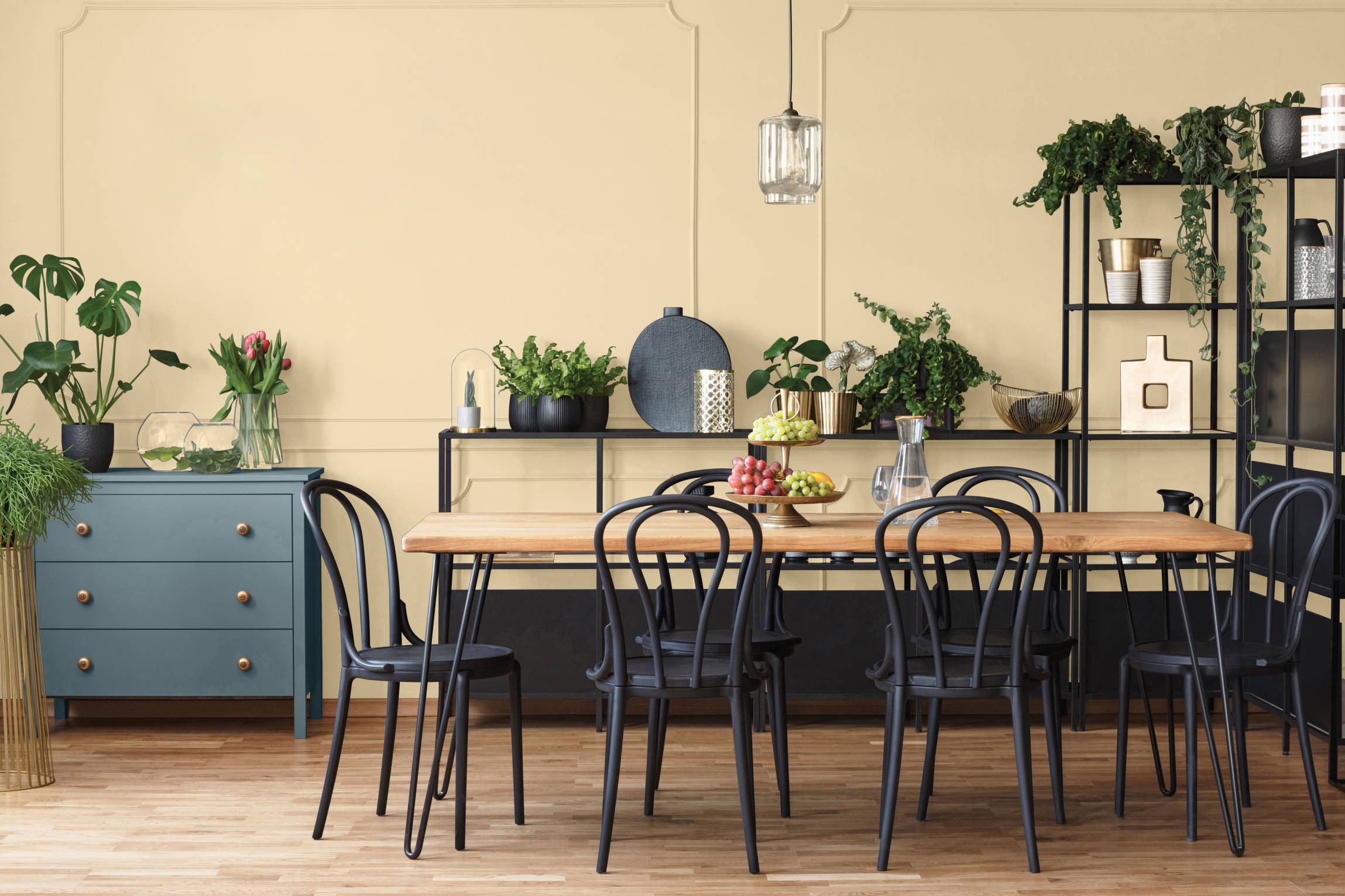
Bring spring into your home with these 5 blooming colours
Beautiful colours they have, those first spring flowers and blossoms! We picked five beautiful and bright colours inspired by spring flowers and blossoms from the trend colour palettes for 2021 by Sigma (PPG Be Wild) and Sikkens (ColourFutures 2021 - Expressive Colours) to create an instant spring feeling in and around your home.

1: White blossoms
Delicate White (PPG1001-1) is the name of the first colour, which is just a perfectly fitting name when you think of white blossoms. Delicate White is a soft white shade, which you can combine with many other (spring) colours and which can function perfectly as a base colour (60 in Sigma's 60-30-10 principle). This colour is also ideal to use in smaller spaces, to create a larger feel, or in low-light areas, where white will provide the necessary brightness without being too bright. You can find this colour in PPG/Sigma's 2021 "Be Wild" trend colour palette.
2: Crocuses
Imagine a crocus whose petals are lit up by sunbeams. Soft, purple-lilac... A colour that radiates calm and relaxation. The colour French Lilac (PPG1246-4), also a trend colour from "Be Wild" (PPG/Sigma), is just such a shade. This soft, calm colour is definitely not overpowering, but instead provides a subtle touch of colour, when used as a supporting colour (30 in Sigma's 60-30-10 principle). So the ideal way to create that spring mood.


3: Soft pink blossoms
You have one of those blossoms that have white and pink petals, which seem to give a beautiful pale pink hue to the trees that bear them. If you walk through an orchard where you find many trees with these blossoms together, it looks like one soft pink, dreamy haze. A colour reminiscent of this is CN.01.81 from the trend colour palette "Be Expressive" (Sikkens, ColourFutures 2021). With its pale pink, slightly beige-like undertone, you can use this colour perfectly as a base colour or as a supporting colour, and then combine it with a warm accent colour.
4: Tulips
Tulips come in a huge range of colours, but red-pink tulips are our favourite. Green and red are complementary colours, making for nice contrasts in the tulip field. The colour that we think fits this very well is the reddish A5.33.39 from the trend colour palette "Be Expressive" (Sikkens, ColourFutures 2021). This shade is great as an accent colour to a warm white, pale pink or beige shade and immediately gives you a warm feeling. Outdoors too, in a garden with lots of greenery, you can show this colour off to great effect. There you imitate the beautiful contrast of the tulip field!


5: Daffodils
Can it be a brighter, sunny and cheerful spring colour for you? Then Fresh Lemonade (PPG1216-5) from PPG/Sigma's "Be Wild" trend colour palette for 2021 is definitely for you! This mischievous yellow, reminiscent of daffodils, can be used as an accent colour (10 in PPG/Sigma's 60-30-10 principle) and will again look perfect both indoors and outdoors. The sunny yellow will still give you that instant spring feeling even during the drizzliest March showers or April whims.

