New in store: Japanese art colours
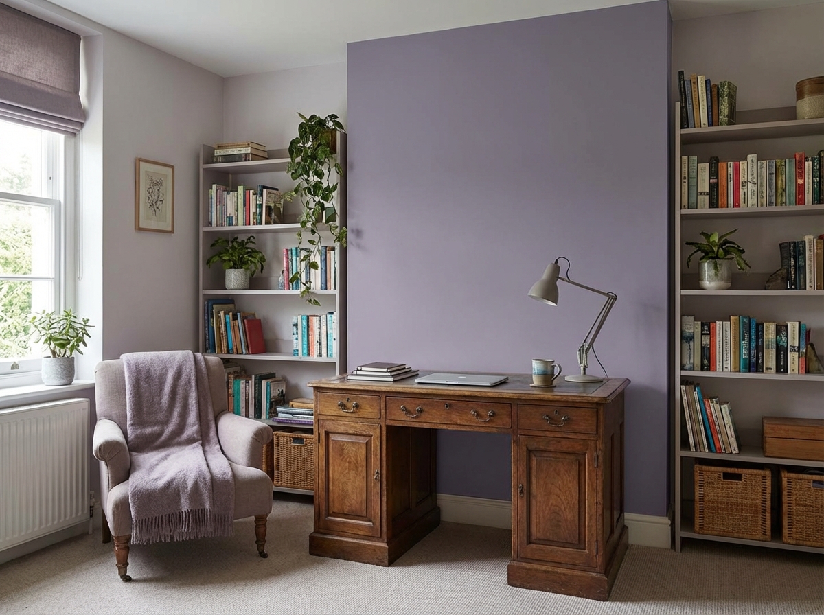
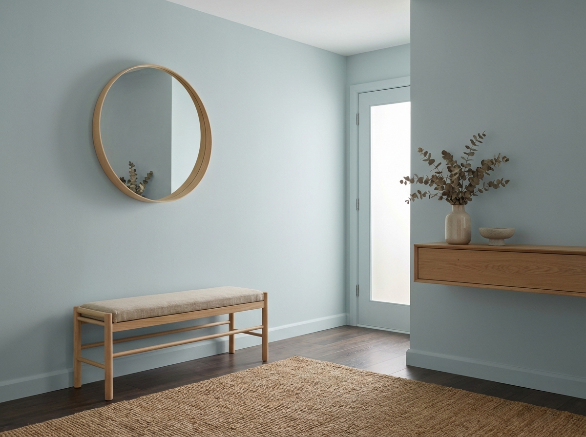
Early Dew x Dove Feather Grey
Early Dew, our soft green tone, remains one of our most popular colours. And it’s easy to see why: this shade radiates calm, freshness and understated elegance. In short, it integrates effortlessly into a wide range of interior styles.
What makes Early Dew particularly special is its complementary relationship with the Japanese colour Dove Feather Grey. This grey with a subtle purple undertone adds depth and brings balance to the soft green of Early Dew. Together, they create a harmonious look with plenty of character. For the Japanese colour Dove Feather Grey, we offer the closest RAL equivalent: RAL 4009.


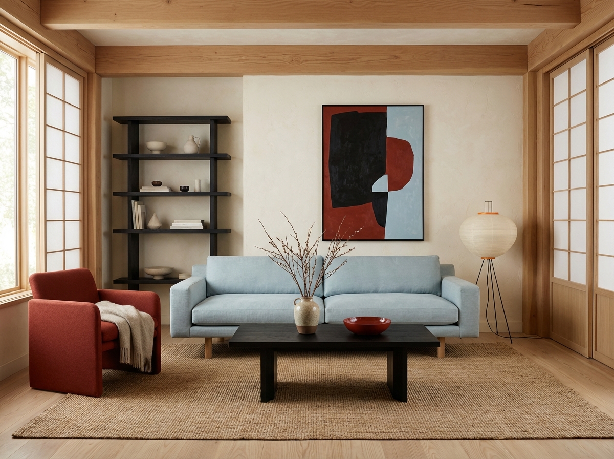
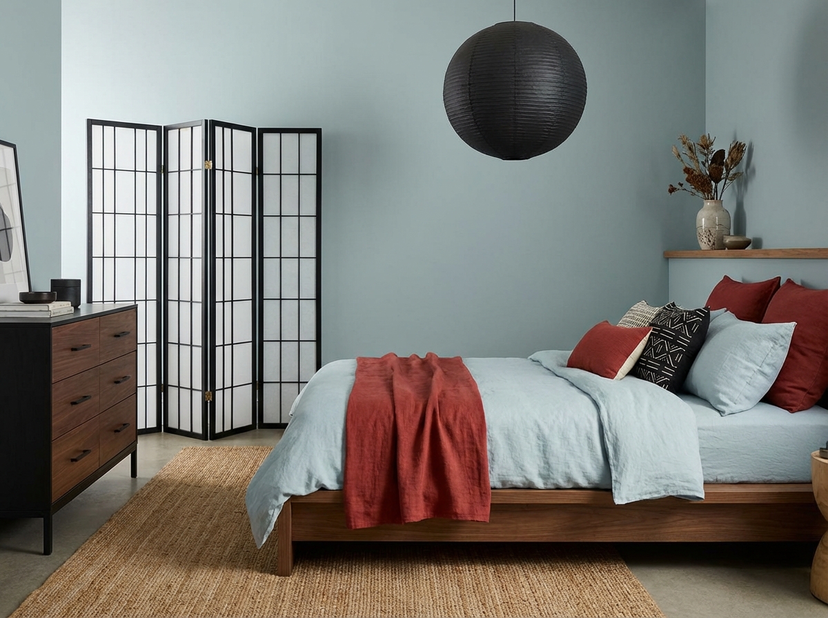
Black x Jasper Red x Pale King’s Blue
The Japanese colour trio Black, Jasper Red and Pale King’s Blue is described in The Dictionary of Colours as a set of three colours that complement each other very well.
Together, these colours form a balanced palette in which contrast and harmony naturally reinforce one another.
In Japanese colour tradition, the focus is not on bold combinations, but on balance and nuance. The deep, warm black provides a stable foundation, adding depth and calm. Jasper Red introduces a grounded energy, evoking associations with nature and craftsmanship. Pale King’s Blue acts as a counterbalance: light and subtly greyed, giving the palette a sense of airiness and serenity.
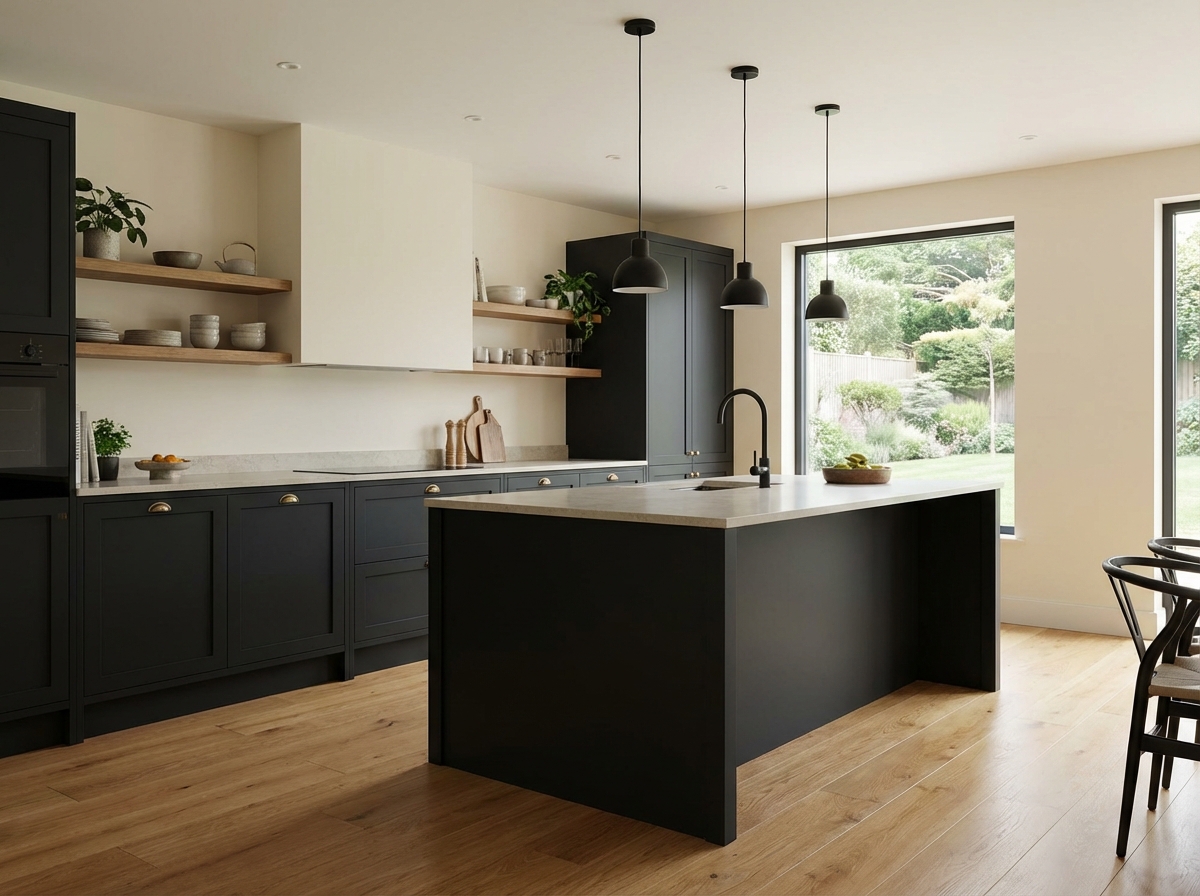
In Japanese colour tradition, black is not harsh or cold, but a deep, warm base that brings calm and structure. With a subtle earthy undertone, this black conveys restrained strength and refinement. It functions as an anchor within a colour palette: framing, adding depth, and allowing other colours to stand out more clearly. In interiors, black creates contrast without overpowering the space, emphasising simplicity. We can offer this colour in the similar shade Ink.
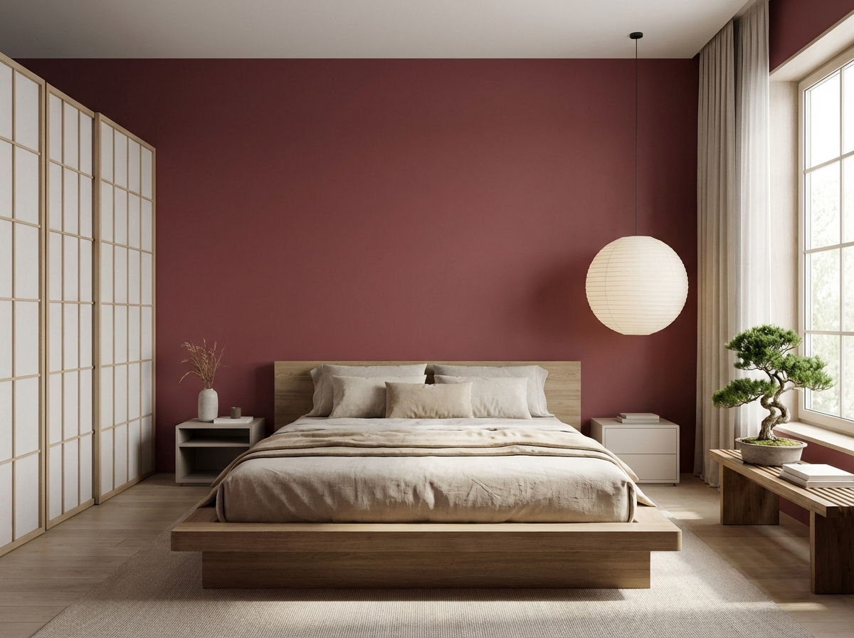
Jasper Red evokes images of heated earth and polished stone. This warm red possesses a natural depth: grounded yet quietly powerful. It adds weight and emotion to a space without disturbing its calm. The colour acts as a subtle focal point-tangible, present and firmly anchored in a sense of reliability.
Pale King’s Blue is a light, refined blue with a soft, greyed undertone. It creates a sense of calm, as if it filters light rather than reflects it. In other words, Pale King’s Blue brings a sense of space to an interior and acts as a counterpoint to warmer shades.
Looking for even more inspiration around Japanese interiors and colour palettes?
Be sure to also take a look at this blog: https://tintrio.be/en/blog/The-Japandi-trend-stylish-light-and-warm
Recent blogs
Can't get enough of the trends in paint land? Then be sure to check out our recent blog posts with even more interior design trends.


